Search this blog

31 March 2017

Wanderlust Layers & Textures

Kasia's lesson for Week 9 of Wanderlust
was about making your own marks on differing surfaces & layering.


I chose a white fabric base for this page,
so I concentrated on the marks & layers rather than the background.

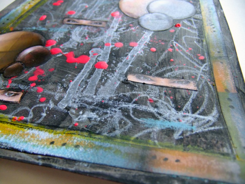
I used Dina Wakley Media acrylic paint (Lemon & Ruby) for my "leaf" shapes.

The paints worked well on the fabric


I used one of my silicone tools instead of a paint brush.


I created the same pattern on white tissue paper.

The tissue paper has an almost waxy feel, which is quite interesting.


Then the same on old book paper.


Once dry I added Distress Crayon (mustard seed & spiced marmalade).


Detail added with a white chinagraph pencil
& Stabilo All black pencil.

I went over the black pencil lines with a waterbrush
& I like how it bled out on the fabric,
creating a shadowy grey.

Not as many layers or as much detail as Kasia's page,
but I think I will leave this one as it is.

I can always cut this one up into pieces to use elsewhere ...
or buy some embroidery threads to add some stitching ...

30 March 2017

You always have a choice

I am taking part in #52CafeCards
which is a year long creative challenge,
creating art on playing cards
following the prompts provided by Marta Lapkowska.

The thirteenth prompt is M for Me.


I adhered crumpled white tissue paper
to the front of the playing card,
to create some texture.

Then I added a layer of First Edition Deco Maché paper.

Finally a figure from The Graphics Fairy & some printed text.

29 March 2017

Just begin

I am taking part in #52CafeCards
which is a year long creative challenge,
creating art on playing cards
following the prompts provided by Marta Lapkowska.

The twelfth prompt is L for Lace.


I adhered crumpled white tissue paper
to the front of the playing card,
to create some texture.

Next layer is Distress Crayon
(mustard seed, spiced marmalade, peacock feathers & twisted citron).

Then a strip of book text,
with Tim Holtz tissue tape (Laboratorie).

Then some lace cut from an old doily
& finished with some printed text.

28 March 2017

Marvel at the Beauty of Life

I am taking part in #52CafeCards
which is a year long creative challenge,
creating art on playing cards
following the prompts provided by Marta Lapkowska.

The eleventh prompt is K for Kaleidoscope.


I adhered crumpled white tissue paper
to the front of the playing card,
to create some texture.

I struggled for ages trying to work out how to approach this prompt,
finally I composed my own quote,
printed out on more white tissue paper.

"View your life
as through a kaleidoscope
and marvel at the beauty
of the ever-changing patterns."

Then added a trio of winged creatures,
which to me are the visual representation of change & transformation.

I also used
Distress Crayon (picked raspberry)
Gelatos (Passion Fruit)

27 March 2017

Live Adventure

On Saturday, Everything Art hosted a Live Adventure on Facebook,
which I replayed today.


I started with a rejected art journal page,
so I didn't mind how this ended up.

Here is the finished page.


With some close up pictures for you.


Kasia picked which prompts to use from our suggestions,


setting a time limit for each prompt


& we used images from any old magazine that we had to hand.


That's it.


Kasia & Jamie always make their lessons fun.
And this was fun.


Royal Sovereign White Chinagraph Pencil
Stabilo All Black Pencil
DecoArt Americana Pink Neon Acrylic Paint
Dylusions White Paint
Distress Crayon (mustard seed & spiced marmalade)
Gelatos (Snow Cone)
clear alphabet stamps
Archival Ink (Jet Black)

07 March 2017

Life is a Journey

I am taking part in #52CafeCards
which is a year long creative challenge,
creating art on playing cards
following the prompts provided by Marta Lapkowska.

The next prompt is J for Journey.


I coated the playing card front in white gesso,
then added crumpled tissue paper,
to create some texture.

I also used
Book text
Tissue Tape
Distress Marker (antique linen)
Printed Text

06 March 2017

Add a Sprinkle of Colour

Have you watched Leandra from Paper Artsy
explaining about their Infusions Coloured Stains?

Infusions create the most amazing backgrounds.

In this video, Leandra also shares some beautiful samples.


To be in with a chance to win a set of the 12 new colours,
Magenta
Slime
Raspberry
Frankly Scarlet
Rocky Road
Terracotta
Rusty Car
Sleight Blue
Olive Tree
Green Man
In the Navy
Violetta
just enter The Craft Barn Blog Candy giveaway.

Click the image below
& follow their instructions.


Close date is 19th March 2017

05 March 2017

Use what you have ...

A delivery from Art from the Heart arrived this week.
Wrapped in red tissue, tied up with string,
opening them is like receiving the very best of presents.

You know you are always going to be delighted with the contents,
because you chose them.


Inside were my Dina Wakley Media paints
together with a piece of cardboard to protect the delivery.

So ... I combine the two to create my mixed media art journal page.


I trimmed the cardboard to fit into my Wanderlust journal,
15cm wide by 21cm tall.

Then I added torn pieces of crumpled white tissue paper,
applied with Mod Podge.

Once dried, I coloured with Dina's paints (Lemon & Lapis)
& left to dry again.

I dry brushed some white paint over the top,
to highlight the texture of the background.

Finally, I splattered the last of my mixed paint over the background.


I added detail with a black Fude Ball 1.5 pen,
then exaggerated the lines with a black Stabilo All pencil.

Then came Distress Crayons on the top,
& Distress Inks around the edges.

The mark making was made with black paint.


To add more dimension to the piece,
I cut into the cardboard in three places to create depth
& to create height, adhered three slivers of cardboard scraps.


The focus is the rusty key.

To age the K&Company key, I used
Ranger Texture Paste,
Distress Inks
& Perfect Pearls,


It is tied to the largest cardboard off-cut
(coloured with Dina's Ruby paint &
Chocolate Gelatos)
with the string from my AFTH delivery.

03 March 2017

Playing with Paint

Creating colour swatches
from three of Dina Wakley Media Heavy Body Acrylic Paints

Not new colours, but now they are available in a new size.
As well as the original 2oz artists tubes,
you can now purchase these paints (& her other mediums) in 1oz bottles,
which is very useful if you like to travel light
or like me, you are just running out of space to store art supplies.

There was a need for these in my artist life, but which colours should I choose?

I really couldn't decide, so to start I plumped for
Lemon, Ruby & Lapis.


Yesterday I spent some time getting to know them,
mixing them,
falling in love with their strong pigment,
adding a little white to make more colours.
I could have played for hours.

The tape in the top corner is the widest Dina Wakley Media Tape (1 inch).
I used strips of tape for any excess paint, with a Tim Holtz Stencil (Faded Dots).
These will be added to projects later on.

I am going to attempt to show you the colours created,
but the light today is very dull.
It's overcast & currently raining.

Firstly the three primary colours.


From the Lemon & Ruby, there was a strong vibrant orange.


From the Lemon & Lapis, there was a deep dark forest green.


From the Ruby & Lapis, there was a sumptuous rich aubergine (eggplant).


Mix all three primary colours & you get a delicious milk chocolate brown,
which to my eye, looks like Umber in Dina's colour chart.


Here are the Primary & Secondary colours together with brown in the middle.


To the Lemon I added a drop of Liquid Pearls (White Opal),
which gave a real sheen & reflection to the surface.


To the other colours, I just added white to create Tints.


Lots more playing to do ...